In the heady jet-set media world of contract publishing, there’s rarely the opportunity to commission original photography or illustration. Consequently, there’s a heavy reliance on stock imagery which can very quickly look a bit samey. I always like to go the extra mile, particularly on cover images, and really sell the story with something more than just a bog standard library photo – a bit of effort rather than just churn out something fast and cheap.
InPharmacy, is the membership magazine of the National Pharmacy Association and goes out to approximately 20,000 pharmacists every 6 weeks or so. The stories are generally about how the NPA assist their members through various business challenges, and in one particular issue, the challenge was red tape & bureaucracy. I always like to make the imagery relatable for the readers, and feature people whenever possible to help that, so the result was the cover below showing two exasperated pharmacists wrapped in red tape.
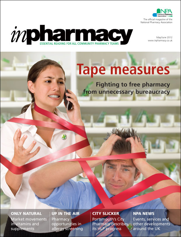
Easy? Er…no. For a start, try searching for stock imagery of ‘frustrated pharmacist in red tape’. So upon a big fat zero useable images coming up, I decided to create something myself that would illustrate it effectively. From the start, I wanted both male and female represented and ideally a mixture of ethnicity. The second part proved a little more tricky in that the results that showed in the time I had, didn’t adequately match each other in angles, or consistency in the lighting, so I set to work with the images below.
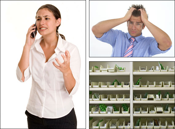
After a bit of trial and error, I decided it worked best with the cover line on the right, which meant the girl going on the left as she was the tallest foreground component. She then needed flipping over as I wanted her facing into the page, not looking off the edge. With both the figures, the next stage was the laborious process of cutting them out of their backgrounds. Even with them both on plain backdrops with plenty of contrast, this is a painstaking job. If you try and do this quickly it will always look terrible, so even with some techniques I’ve worked out over the years, there’s no shortcut to getting this looking good.
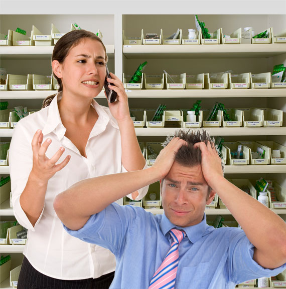
So at this stage, the basic composition is there, but we’re still very rough round the edges and the background is sharp & contrasty, jumping forward when I want it to sit back. So some time is spent on the background image, brightening it, flattening out some of the contrast, and giving it a subtle depth-of-field blur, to ensure that our pharmacists are what we look at, and we can read the cover line over it.
Then we need to go back and look at the hair, particularly on the male figure. The edges of clothes are easier to get away with, but hair is tricky. A lot of burning in and feathering of the edges went into this one; it’s inevitable that some of the original background will survive the cutout process, but just how much you can’t really tell until your figure is sitting in it’s new environment.
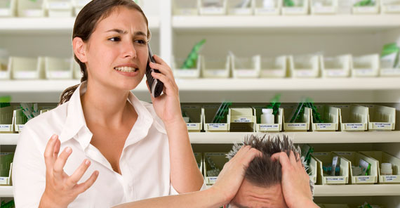
I spent a short time experimenting with images of actual red tape, but the best option turned out to be just to draw the tape in directly in Photoshop. Using photos for reference on how the shadows and highlights work on such a plasticky surface, I mainly just airbrushed the colour straight in, then used the dodge & burn for shadows & highlights.
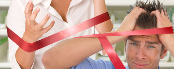
The final stages were adding shadows from the tape onto the figures, and a last colour correction to ensure they appeared like they were in the same room when photographed. A last finishing touch was the little badge with the green pharmacy cross that they both wear, and job done.


