[quote author=”Reid Miles”]
“Fifty Bucks an album…they loved it, thought it was modern, they thought it went with the music… one or two colors to work with at that time and some outrageous graphics!”
[/quote]
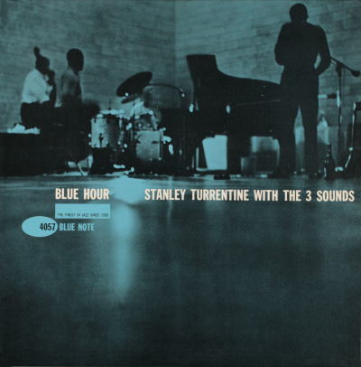
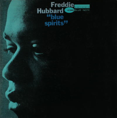
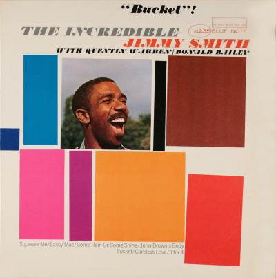
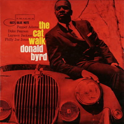
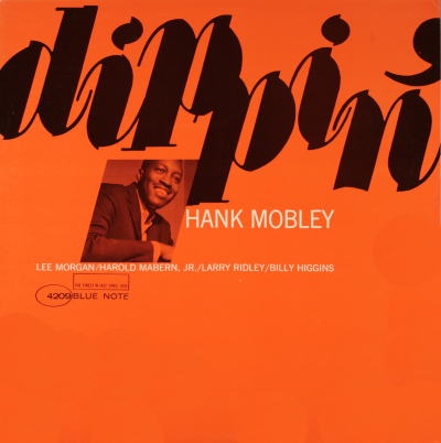
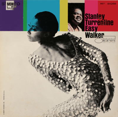
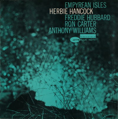
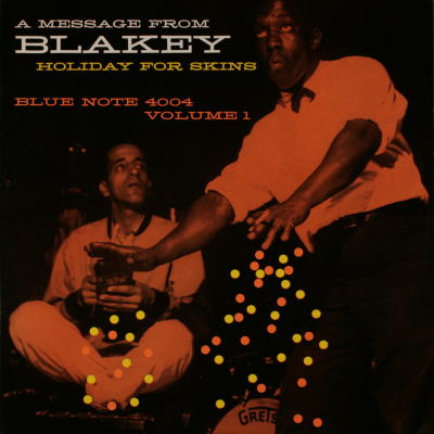
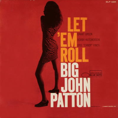
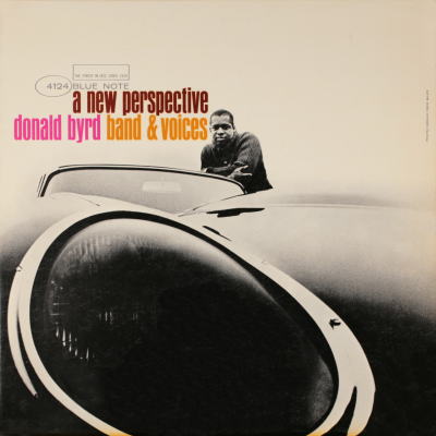
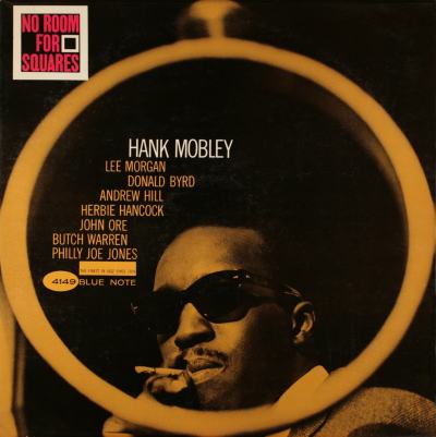
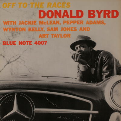
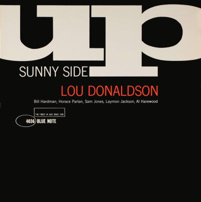
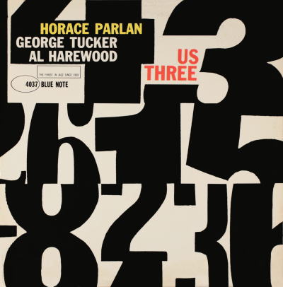
Between 1955 & 1967, Reid Miles was the designer at jazz label Blue Note Records. Known as a label that let their musicians express themselves their own way, this ideal obviously crossed into the sleeve designs as well. Although apparently not a jazz aficionado (he was more into classical music), Miles was clearly in tune with the sensibility. His style, whether the toned black & white photographs (frequently by Francis Wolff) or the playful, dynamic typography has come to be inextricably linked with the form. These techniques were initially down to the low production budgets he had to work with, but Miles took those restrictions and elevated Blue Note’s design output into true 20th Century classics that are often referred to today. A fine example of sound and vision complementing each other perfectly and creating a whole far greater than the sum of its parts. Although at over 500 sleeves, there are way too many to present in one post, a few of my favourites are presented here, and a far more exhaustive compilation can be seen at this Japanese site.