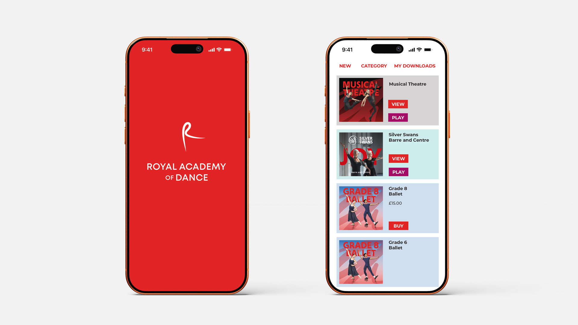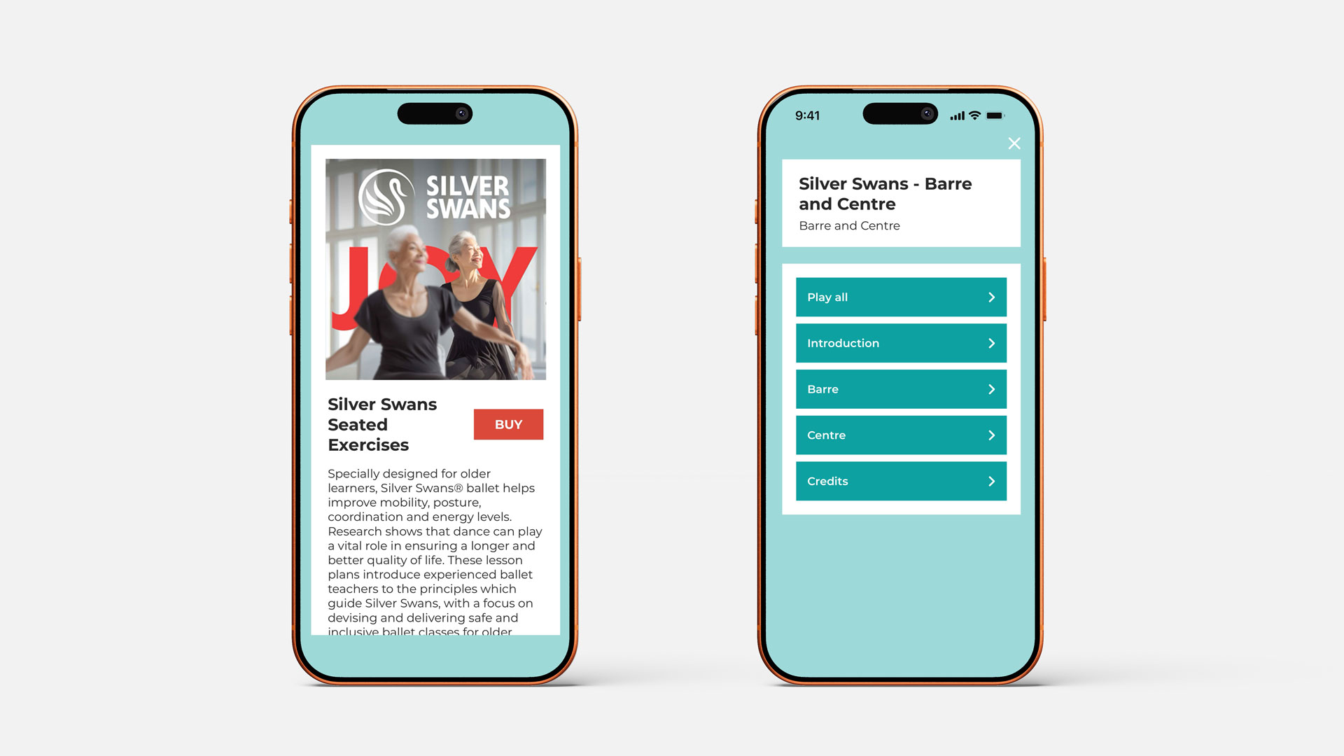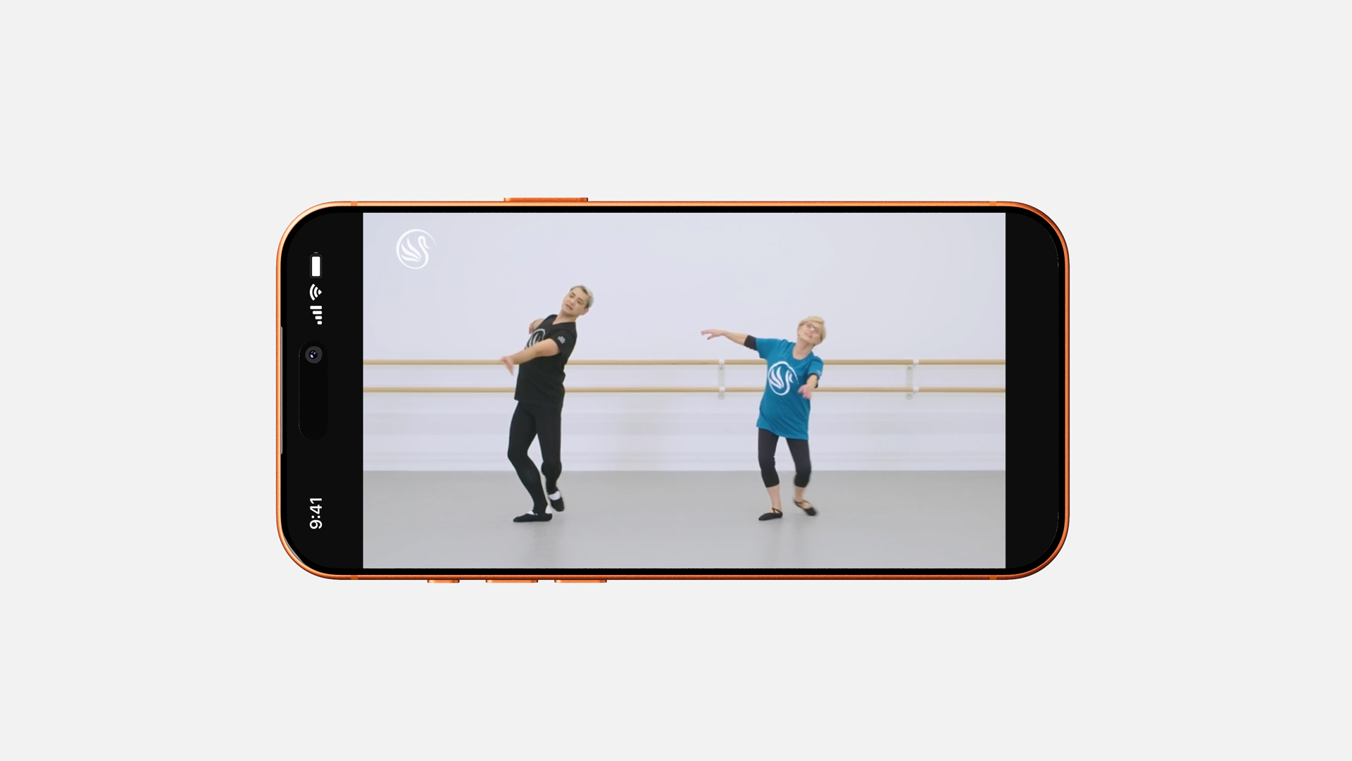
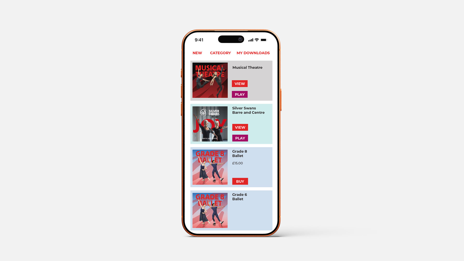
A new UI expression of the RAD brand, across mobile and tablet
Creative direction and visual design for a major UI refresh of the Royal Academy of Dance app – bringing the current RAD brand to the mobile and tablet experience while working within existing functionality, technical constraints and budget.
The Royal Academy of Dance app was ready for a visual refresh. While the fundamental user journey and functionality remained unchanged, the existing interface had become dated and no longer reflected the confidence, clarity and distinctive character of the current RAD brand.
Working within existing technical and budgetary constraints, I led the visual refresh across the iPhone and iPad experience – bringing the app into line with the current Royal Academy of Dance identity while creating a cleaner, more contemporary and engaging digital experience.
The challenge was to make a meaningful transformation without rebuilding the product from the ground up.
The refresh introduced the current RAD visual language across the interface, including typography, colour, imagery, graphic elements and overall composition. Existing functionality and navigation were retained, allowing the focus to remain on improving the visual experience and bringing greater consistency to the wider RAD digital ecosystem.
With the underlying user journey remaining largely intact, the project demonstrates how much impact can be achieved through a focused visual and brand-led intervention.
By working within the existing framework, the app could be brought up to date without the time, cost and disruption associated with a complete rebuild.