Cosmic, angry, soulful, spiritual, political – twelve great soul music album covers
As a music lover and into the visual arts, record sleeves have always been something I’ve taken a lot of interest in. I love classic soul music, and what I like about the way these are packaged, is that in a huge variety of ways, they’re as expressive as the music they contain. It’s no coincidence that many of these come from the 1970s. A politically charged time when many artists were flexing their creative muscles; when many of the Motown acts, for example, had been freed of the production-line songwriting and recording processes of the 60s, and were keen to be seen as independent, individual musicians. In contrast to many of the cheaply, quickly produced sleeves of the previous decade, it became important for the album cover to be part of the artistic statement. Presented here are a few of my favourites which include a couple of more recent examples.
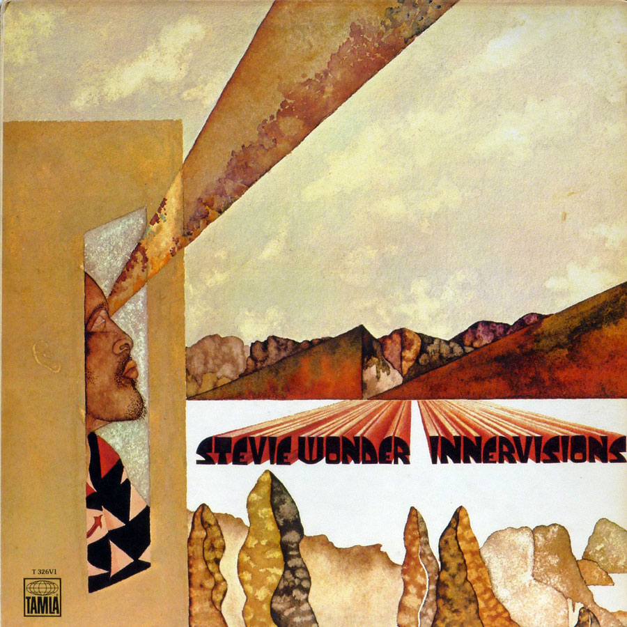
Stevie Wonder – Innervisions (1973)
Arguably Stevie Wonder’s masterpiece, Innervisions takes on all the world’s issues as its subject matter; drug abuse, racism, politicians and the justice system. The iconic sleeve illustration by Effram Woolf shows Wonder, close to the natural world in a desert dwelling, seeing all these problems and their solutions.
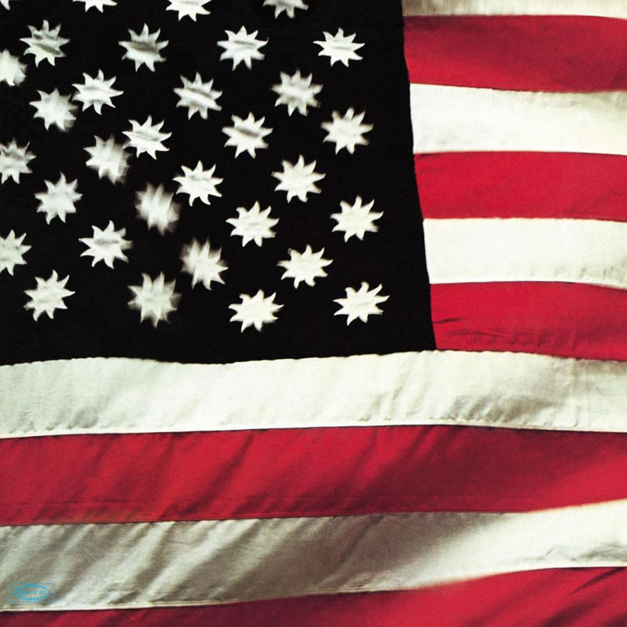
Sly and the Family Stone – There’s a Riot Goin’ On (1971)
This was recorded largely just by Sly Stone, amidst a period when his drug use was alienating much of the band. With a darker, more pessimistic sound than their previous work, the album was met with negativity upon its release but has since been largely reevaluated as among their best work. Notable for its complete lack of text, Sly Stone described the cover concept, stating “I wanted the flag to truly represent people of all colors. I wanted the color black because it is the absence of color. I wanted the color white because it is the combination of all colors. And I wanted the color red because it represents the one thing that all people have in common: blood. I wanted suns instead of stars because stars to me imply searching, like you search for your star. And there are already too many stars in this world.” Quote: Wikipedia

The O’Jays – Ship Ahoy (1973)
The cover of the album depicted the band in a slave hold with illustrations of slaves. In its review, PopMatters commented that the use by producers Gamble and Huff of this imagery demonstrated not only their freedom as the heads of Philadelphia International Records, but also “how seriously the duo viewed popular music as a vehicle to ‘teach and preach’.” According to The Greatest Album Covers of All Time, the production of such politically conscious imagery from a band known for its popular music “was enough to make even the most myopic of white music fans take note that something was changing.” Illustrator James Barkley was otherwise better known for illustrating children’s books
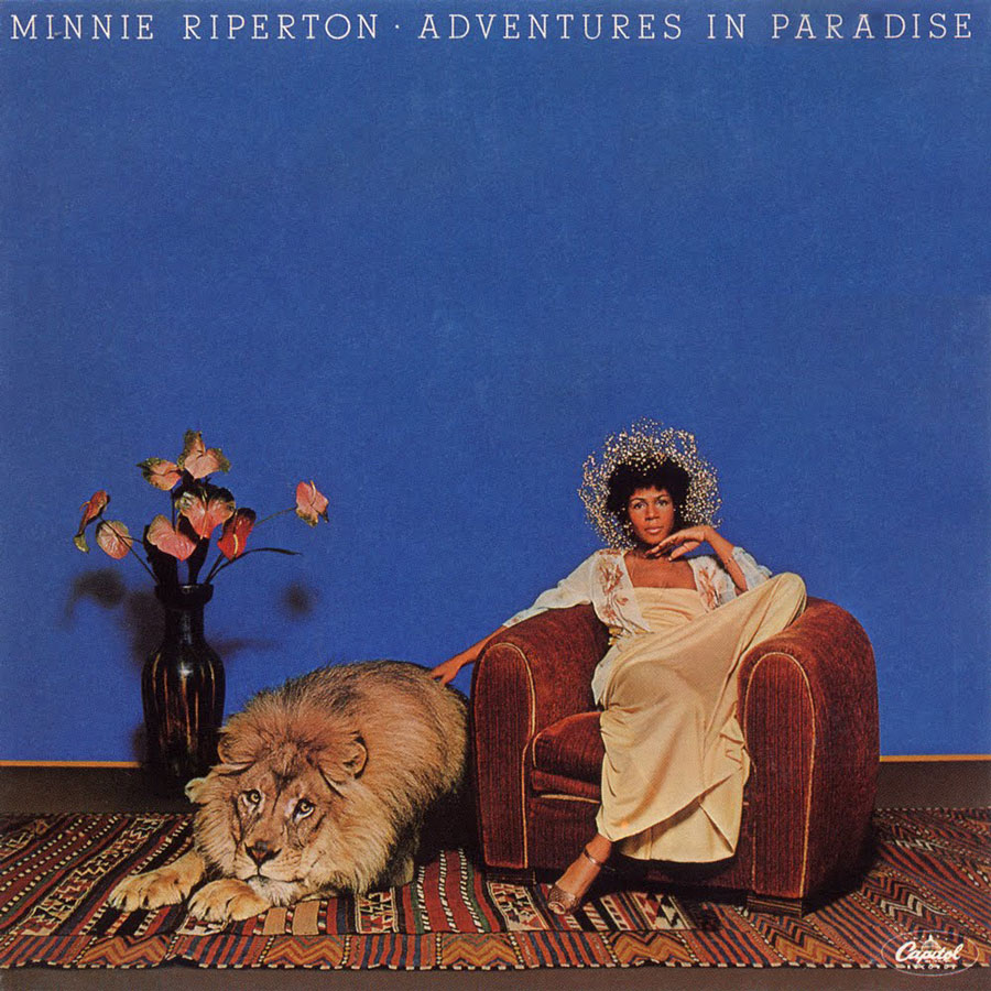
Minnie Riperton – Adventures in Paradise (1975)
Produced while Minnie Riperton was on a hot streak after the worldwide success of the single Lovin’ You, the sleeve for Adventures in Paradise is notable for what happened on set when the image was being reproduced for promotional purposes. Long before the time a concept like this would have been safely assembled in Photoshop, this was set up for real. During the course of the shoot, the lion lunged at Minnie and had to be subdued quickly by its handler. She spoke about the incident on a talk show with Sammy Davis Jnr here.
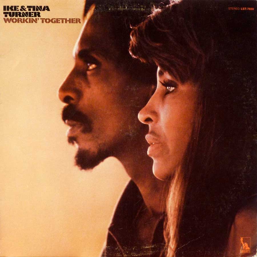
Ike & Tina Turner – Workin’ T0gether (1971)
Their biggest hit as an album, and rightly so as there’s some great stuff on here. But knowing the couple’s history, what a prophetic photo; Ike, the wild, driven, musical genius already addicted to cocaine; Tina calmly focusing her gaze somewhere completely different, exit strategy already formulating?
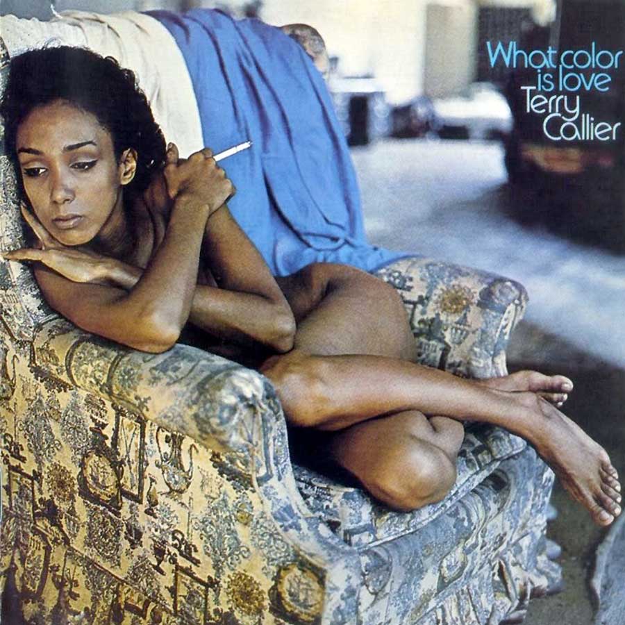
Terry Callier – What Color is Love (1972)
This amazing album sold poorly on its release, despite some fantastic material and Charles Stepney’s beautiful production. The stunning sleeve photo implies a whole story in itself, tonally a perfect fit with Callier’s rich voice and and the lush, jazzy backing.
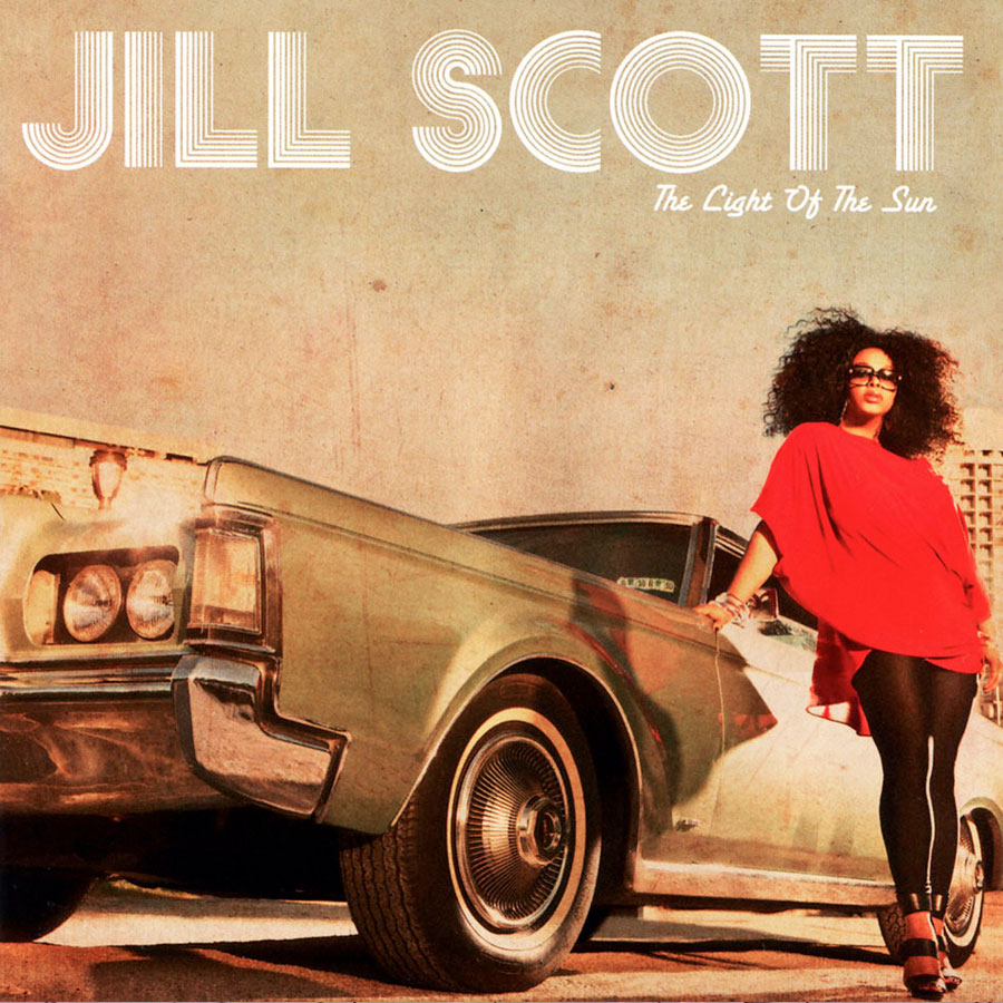
Jill Scott – Light of the Sun (2011)
The retro typeface, the old car and the ageing effects on the image position this as a classic soul album. Scott herself though appears to be every bit the modern woman, so there’s a time travel aspect to this, that’s thoroughly appropriate to the music contained here.
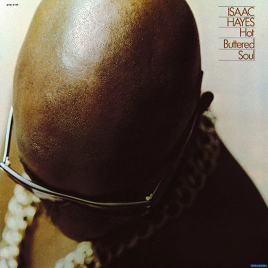
Isaac Hayes – Hot buttered soul (1969)
The shaved head, the chains and the sunglasses – the three things that would become visually synonymous with Hayes, all front and centre for the first time in a landmark soul recording. Designer Christopher Whorf would also help create one or two other notable photographic-led album sleeves, such as John Lennon’s Double Fantasy, and Donna Summer’s She works hard for the money.

Earth, Wind and Fire – Last Days and Time (1972)
Painted by Mati Klarwein, Earth, Wind and Fire’s Last Days and Time from 1972 shows the band early in their career, at a point when their particular brand of mystic optimism hadn’t yet fully coalesced. Klarwein was a painter who, during the 60s became hugely influenced by a mixture of pop culture and surrealism, and three years before had painted the iconic gatefold sleeve to Miles Davis’ “Bitches Brew”. His combination of realism and psychedelia has gone on to influence other artists, notably Oakland-based Joshua Mays who, like Earth, Wind and Fire has become a key reference point for Afrofuturism.
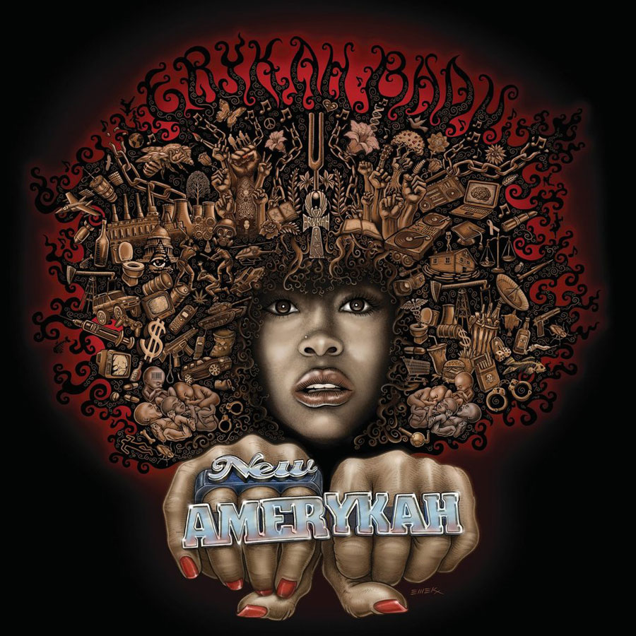
Erykah Badu – New Amerykah (2002)
A collaborative design between Erykah Badu and Brooklyn based artist Kyle Goen, and painted by Emek. This is an excellent, state-of-the-nation type album from an artist never afraid to wear her heart on her sleeve (so to speak), so all the issues on her mind are front and centre. Tonally (if not thematically), there’s something about Emek’s work with Badu that reminds me of the illustrative sleeve for Marvin Gaye’s I Want You by Ernie Barnes.
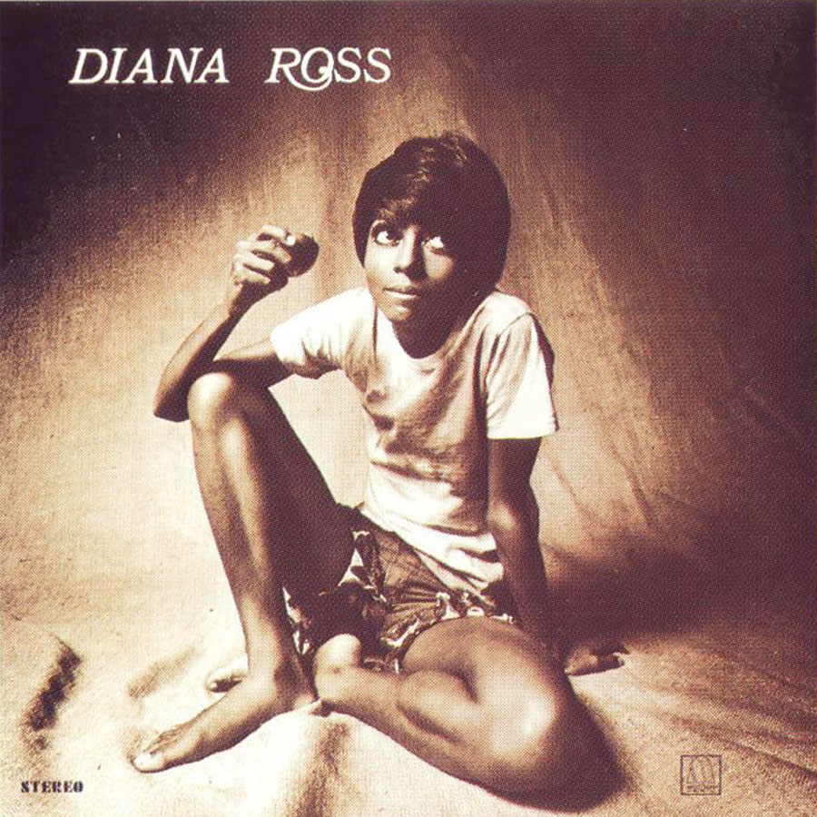
Diana Ross (1970)
Diana’s first solo album, from 1970, depicted the absolute antithesis of her image with the Supremes. In terms of its content, 10 of the 11 tracks here were written and produced by Ashford and Simpson, so not such a departure from the Motown mold in that sense, but certainly the cover photograph suggested a radical new direction. Bit of a shame about the letterspacing though, which could well have been done with Letraset (for anybody old enough to remember that).
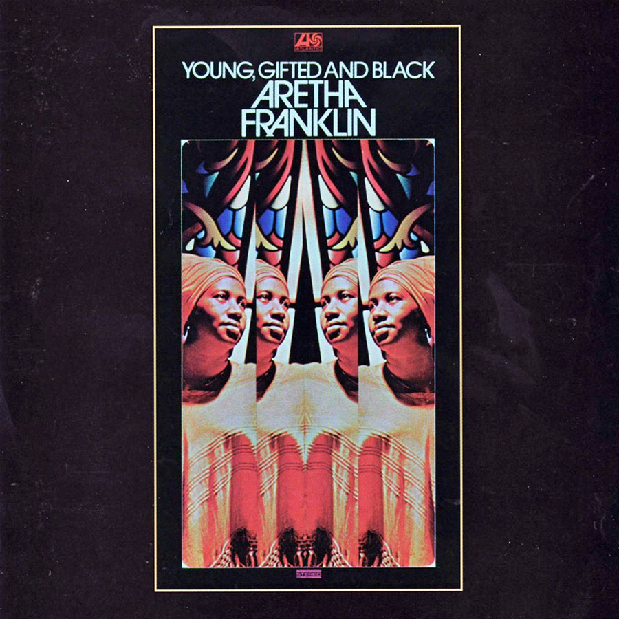
Aretha Franklin – Young, Gifted and Black (1972)
Designed by Stanislaw Zagorski, who had previously produced sleeve designs for The Velvet Underground, Otis Redding, and Sam & Dave. Aretha’s four reflections have been speculated to symbolise the musical strands on this album – political, gospel, rock and soul. Either way, there’s a confident spirituality about it that entirely suits an album where the Queen of Soul was at her very best.


